
The Project
Update the U.S. News Money team's Credit Card Category pages, in order to improve usability and increase lead generation conversions.
Background
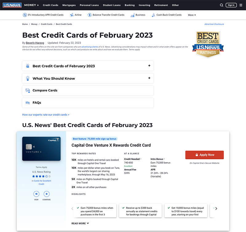
U.S. News is known for providing trustworthy, unbiased advice that helps people make important life decisions. In Money, the Credit Card Category pages rank and evaluate different credit cards, helping readers identify which card would be the best fit for them. This section gets thousands of visits a month, mostly from organic traffic, and makes a lot of money for the business. These pages already perform well, but the team wanted to find ways to optimize them further. I was brought in as lead designer to lead research and design implementation.
Iterative Design Approach
Because this section is important for our users and the business, and it is already performing well, we approach any updates with caution and data. We rely on research to shape design changes, and we test these changes slowly before releasing them to everyone.
Usability Research
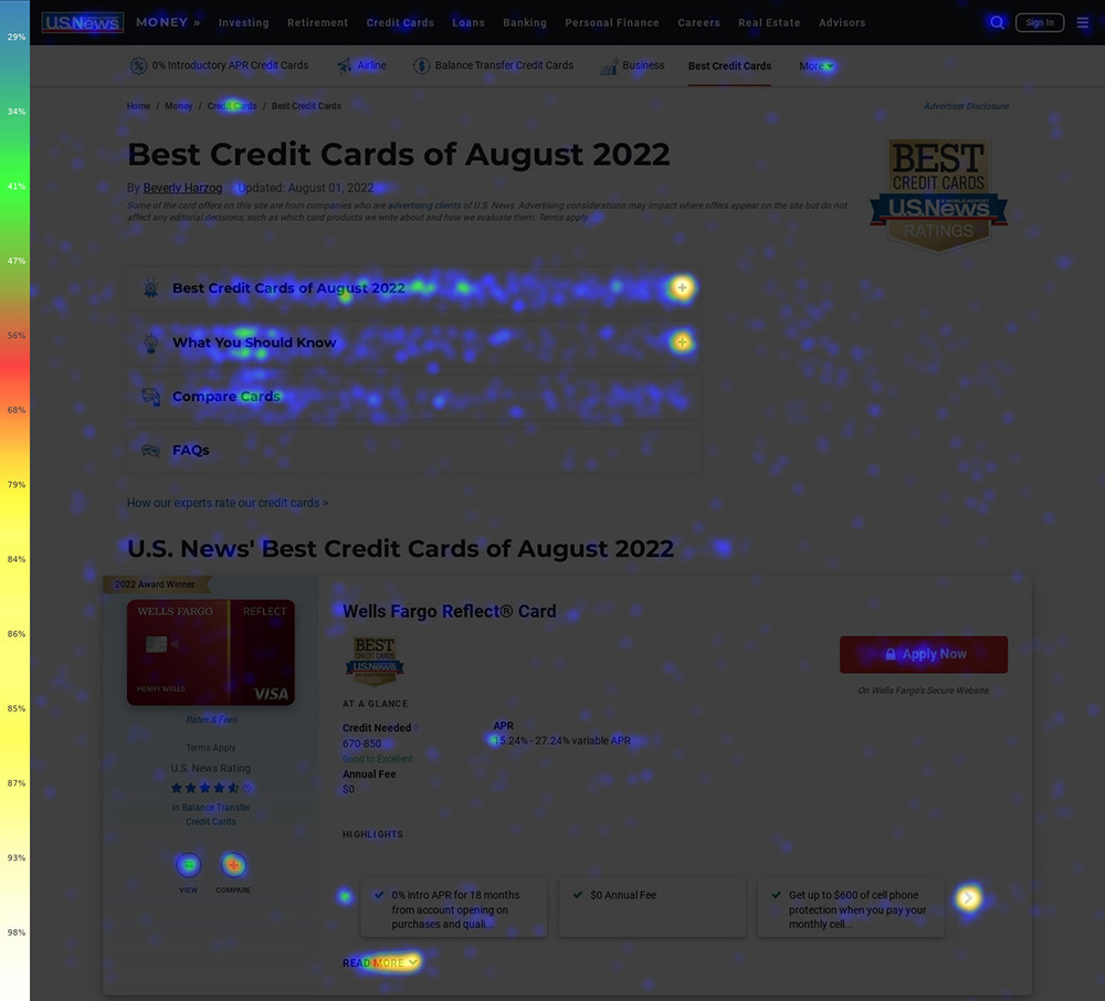
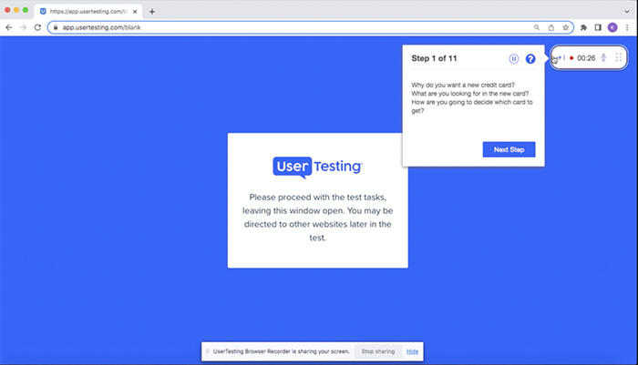
In order to better understand how users were currently interacting with these pages, I conducted usability research. I ran heat maps with CrazyEgg, and conducted user tests through Usertesting.com.
Main Takeaways
-
People generally start their search already knowing which category of credit card they are looking for.
I'm looking for a card that has more points, benefits, and travel rewards.
I'm trying to repair and improve my credit.
- People want to easily compare data points between cards. There are certain top data points that most people want to see like APR, fees, and credit needed. And then some people are also interested in seeing additional highlight information.
- The list of top credit cards is the number one item people want to see on the pages. There is also some interest in seeing helpful editorial content, but most people don't scroll down far enough to find it.
Establishing Goals
Once the usability research was complete, I collaborated with the product manager, tech lead, and SEO analyst to set up optimization goals based on these results.
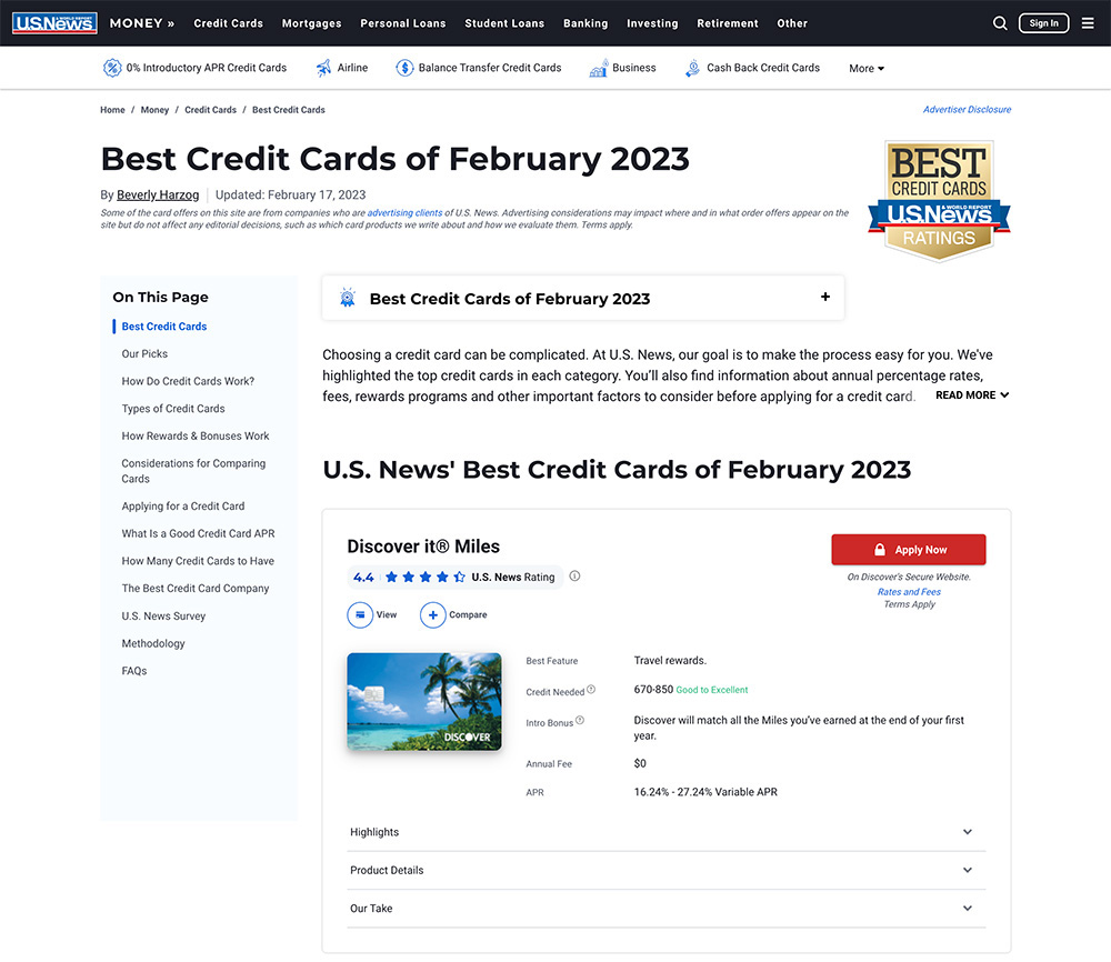
Primary Goal: Optimize List of Top Credit Cards
We heard repeatedly that people mainly want to see and compare the top credit cards.
- Move the list of cards higher up, preferably above the fold.
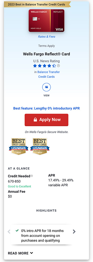
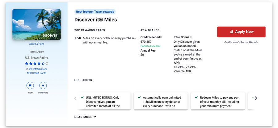
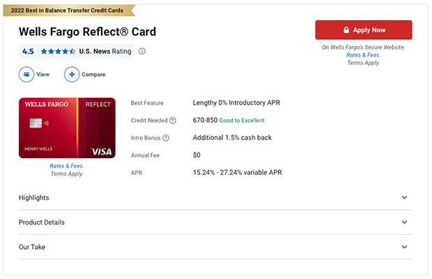
- Rework the card layout to be more scannable and highlight the most important data points. Include additional information behind an expand feature for people who want to see more.
- Prioritize the “Apply Now” call to action, and include secondary actions like “compare” and “see profile.”
- Design the card layout to accommodate data outliers. Many of the data points come from a partner API, and some data is longer than what the current cards were designed to hold.
Secondary Goal: Highlight the Editorial Content
- Add a table of contents to the page to make the editorial content easier to find.
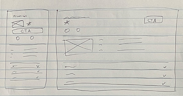
The Design
With these goals in mind, I got to work sketching out ideas. I then moved into high-fidelity mockups, using real data to make sure the layout would work in practice.
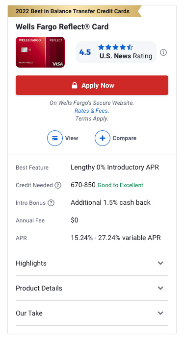
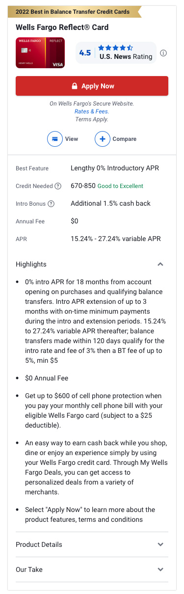
The new card design is more streamlined, with more white space and less bold text to make it scannable. The most important data points are highlighted in the default view, and then the accordions provide progressive disclosure for people (and Google) who want more information. And the cards are a bit shorter on mobile, so you can now see the whole card on a screen.
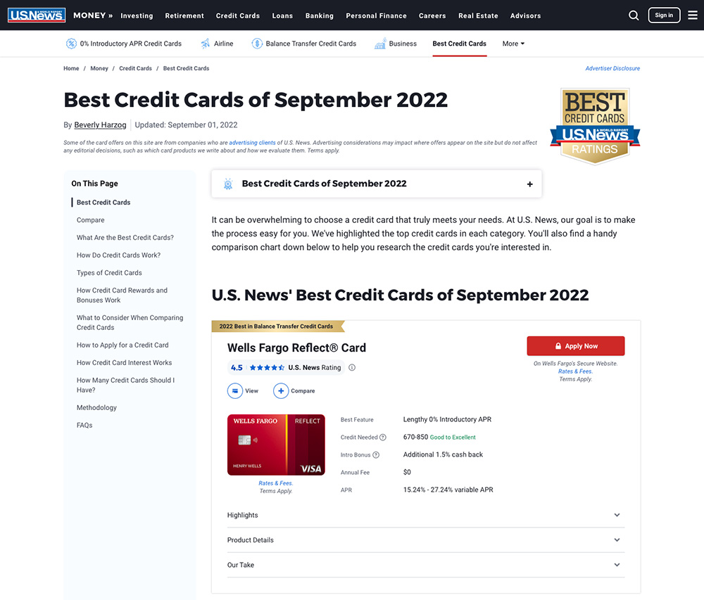
The page now has a table of contents in the left rail on desktop, so that people can find the editorial content further down the page. After discussing with the product team, we decided to put the mobile table of contents below the cards instead of at the top of the page. This way, the secondary goal would not interfere with the primary goal of highlighting the list of top credit cards. We intend to A/B test this placement later.
Feedback and Build
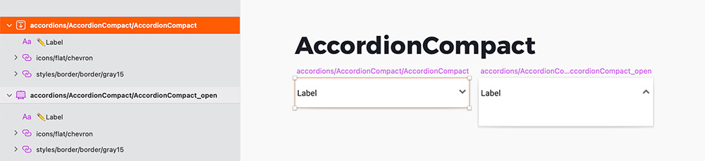
After a couple rounds of feedback that included adding some explanatory tooltips and adjusting the layout for some data outliers, it was time for the tech handoff. I created frontend assembly tickets and included style, behavior, and accessibility requirements. I met with the tech team to discuss the tickets, and we talked through the requirements, including creating a new AccordionCompact reusable component for the cards. I also built the corresponding AccordionCompact symbol for our Sketch library.
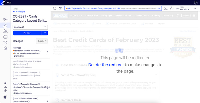
Once the development work was complete, I QAed the updates and worked with one of the developers to set up a split url test in Optimizely. We are going to be testing the new layout compared with the current version to see how the changes impact lead generation clicks as well as page engagement. The test will be launching soon, and hopefully we will see some positive results.
Next Steps
We have plans to continue testing and optimizing these category pages. Once the new design launches, I will run another round of heat maps and user tests for some feedback. We also intend to A/B test the placement of the table of contents on mobile. And for a future project, we are discussing adding a filter feature to the list of credit cards.
Through continuous testing and optimization, we will keep working to provide our users with clear and actionable advice that empowers them to make informed financial decisions.